Slideshow
The Slideshow section is a Collection Type that allows you to build and manage entries for visually presenting structured content in the app. To see how these slideshows appear and behave inside the app, go to the Slideshow-Tab in the App section.
Video Tutorial
This video tutorial shows you how to create a new Slideshow entry, upload a thumbnail, add and reorder various content components, and then save, publish, and review your completed slideshow.
Overview
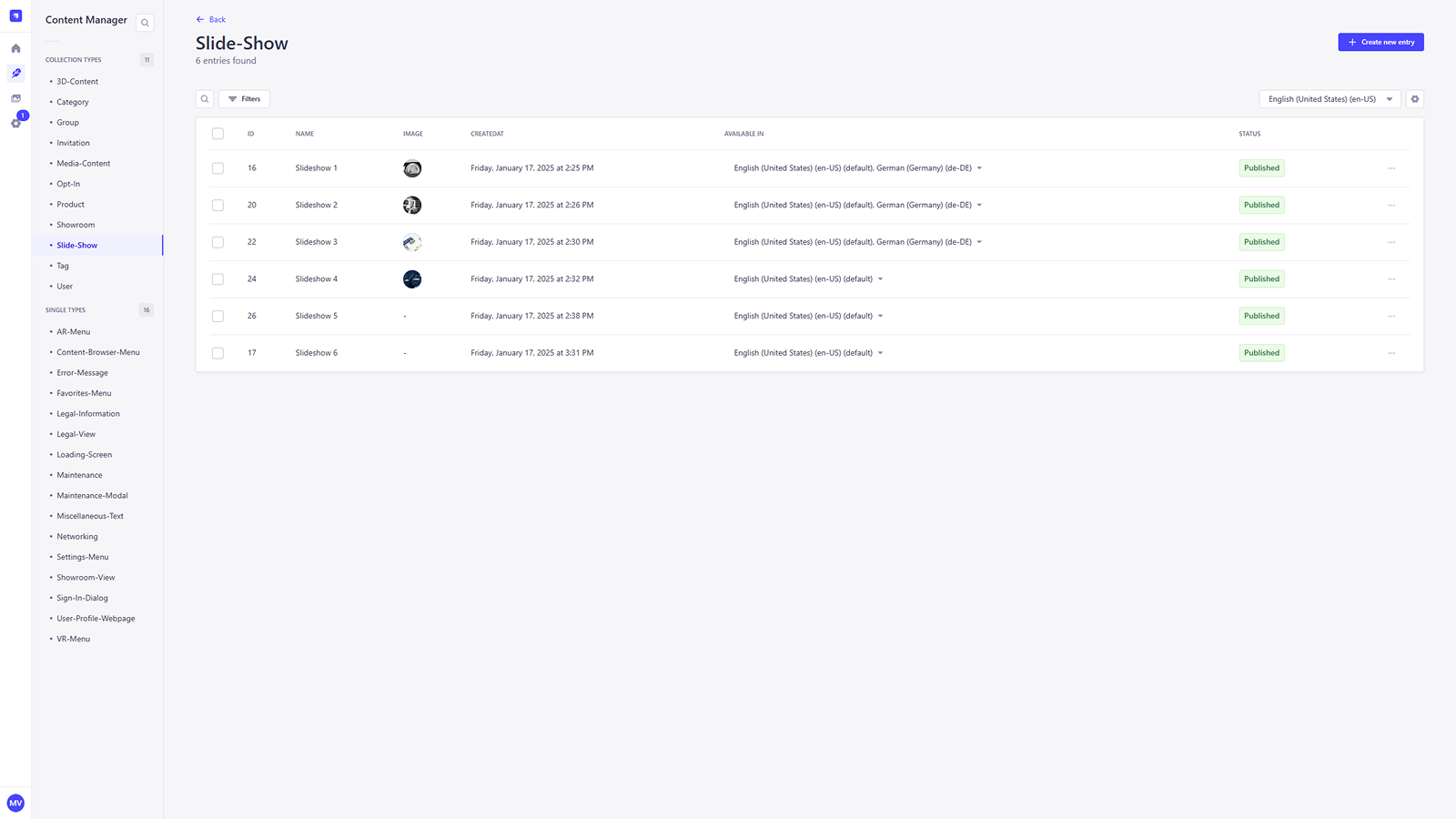
The Slideshow section lists all created slideshow entries used within the application. Each entry displays key information such as name, ID, creation and update timestamps, supported language versions, and publication status. This interface allows for efficient management and quick access to individual slideshow records.
Adding a new slideshow
To create a new slideshow entry, click the + Create new entry button in the top-right corner of the Slideshow view. This will open the entry editor where you can begin building your slideshow.
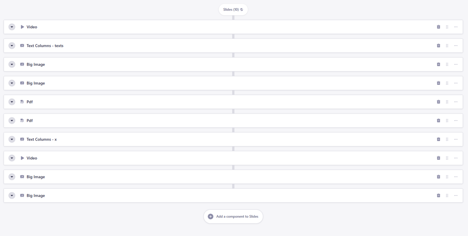
Building the slideshow
A slideshow entry consists of one or more slides, which can be filled with a variety of content components. Each slide is fully customizable, and you can add, reorder, or remove components at any time.
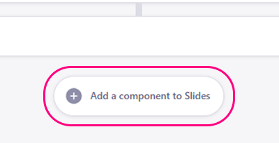
Add a Slide component
To add a slide, scroll to the Slides section and click the Add a component to Slides button. This will open a component picker where you can choose from multiple layouts and media options.
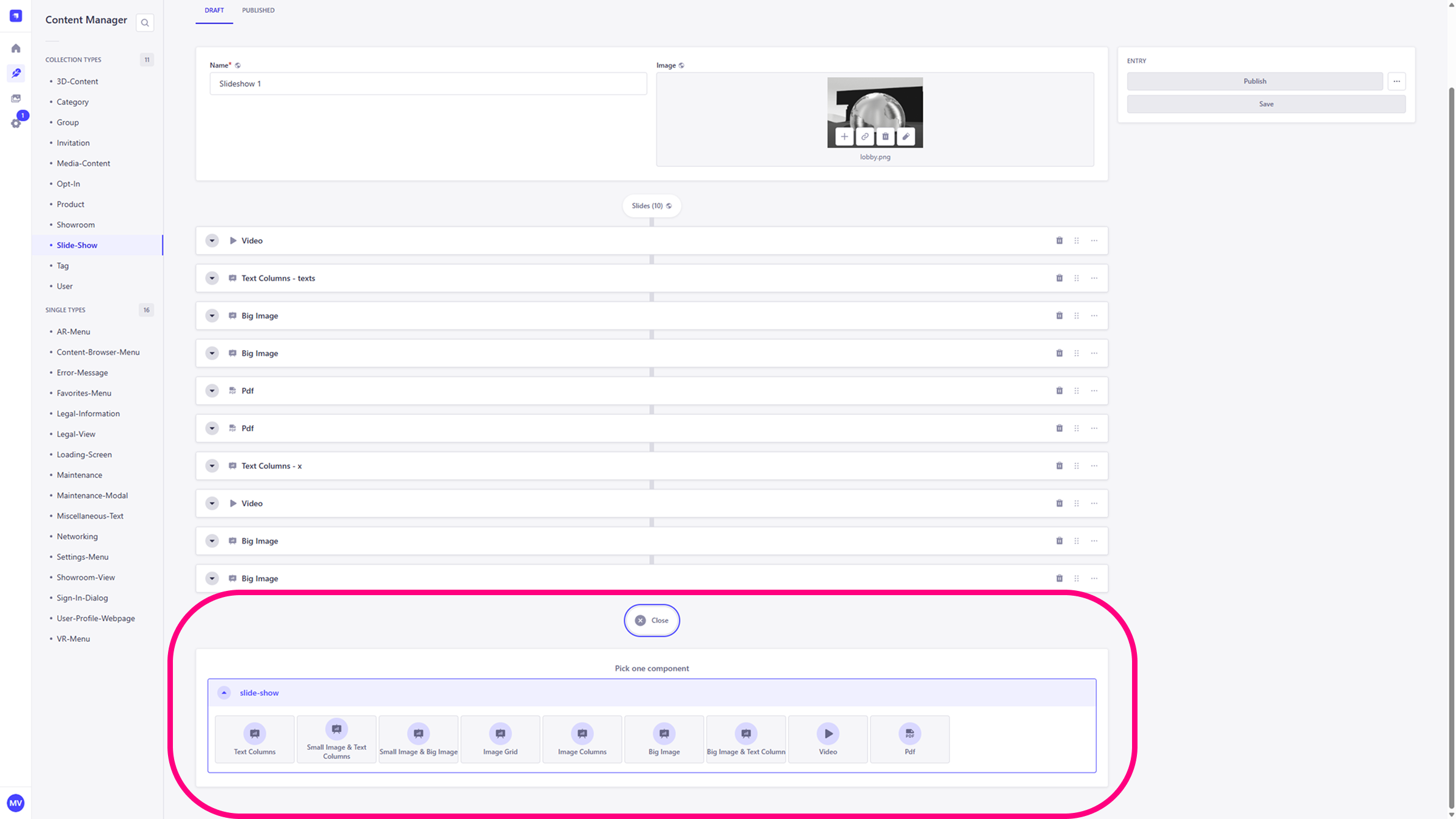
Component Types
The following component types are available for your slideshow:
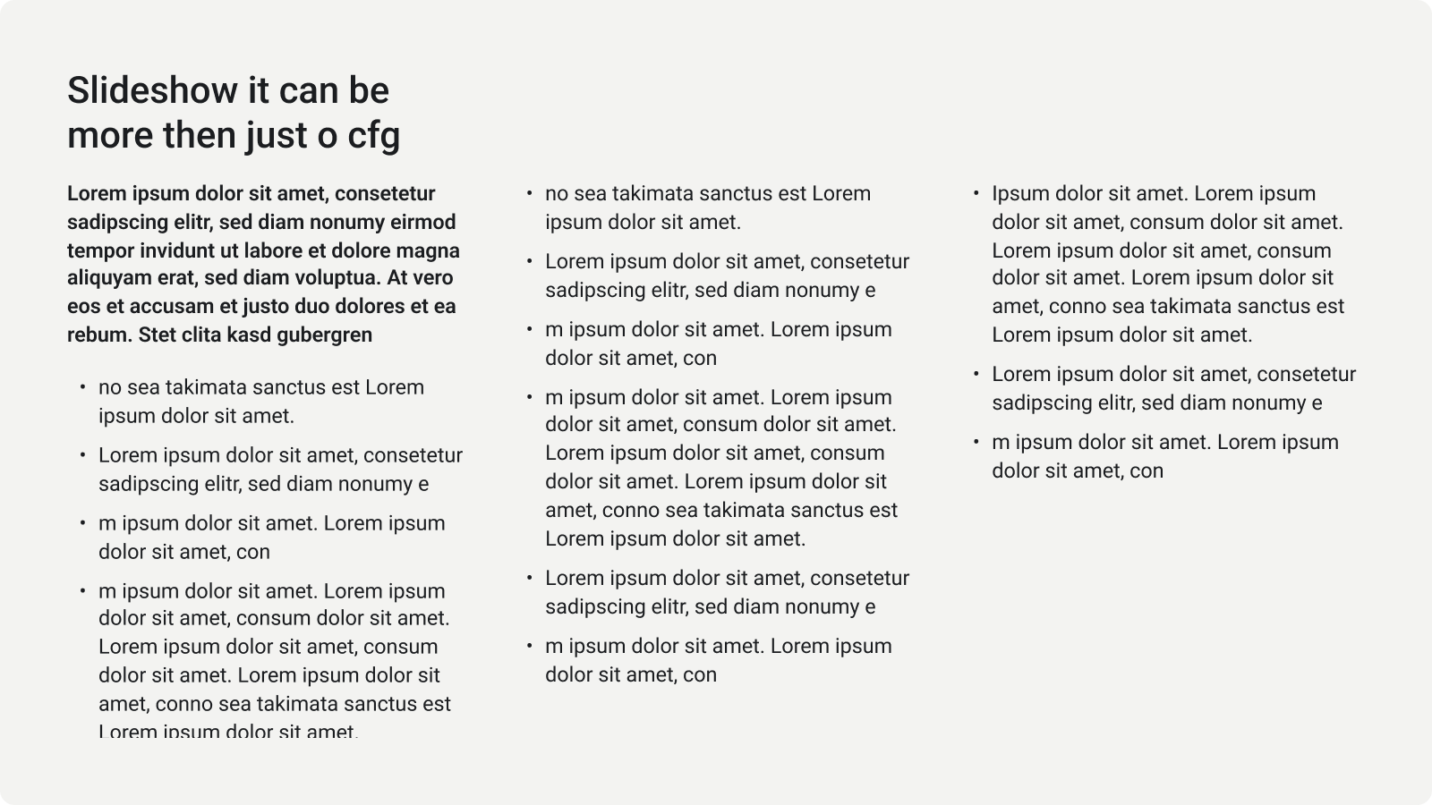
3 Text
Three balanced text columns.
1 M Image & 2 Text
One medium image paired with two text columns.
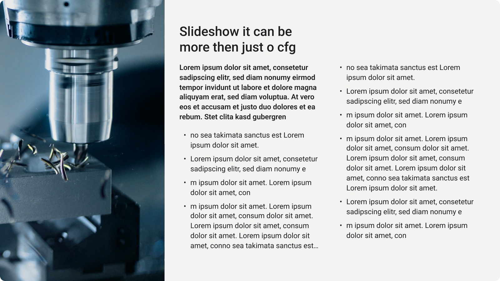
1 L Image & 1 Text
One large image paired with one text column.

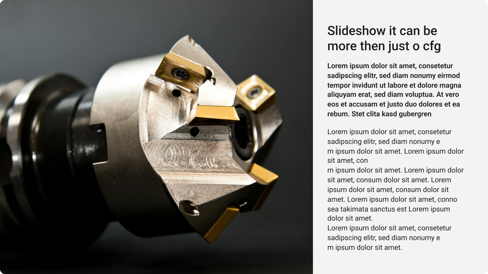
1 L Image & 2 Text
One large image with two stacked text columns.
CMS field naming
In the CMS, the input fields are labeled LeftTextColumn and RightTextColumn. Please note that in the slideshow, these are stacked vertically rather than side-by-side. The following picture presents the layout.
1 XL Image
A full-width image layout.

3 M Images
A balanced grid featuring three medium-sized images.

1 M Image & 1 L Image
A side-by-side composition of a medium and a large image.

6 S Images
A balanced grid of six small images.

Video
Full-screen video playback. Image coming soon...
PDF
Full-screen PDF document viewer. Image coming soon...
Editing slides
Each slide offers basic editing actions accessible through the icons on the right side:
- Expand/Collapse: Click the triangle icon on the left to expand the slide and access its editing fields. Clicking it again will collapse the slide.
- Delete: Click the trash bin icon to remove the selected slide from your slideshow.
- Drag: Use the drag handle to change the order of your slides by dragging them into a new position.
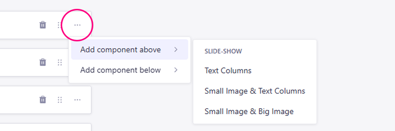
- More Actions: Click the three-dot menu to insert new components above or below the current slide.